Basic Module Structure
Overview
The basic structure of each admin module, except the Memorials module, consist of a top form area containing an input area for each of the related table's fields and a bottom table area containing all the records associated with the subject module.
Form Area
As shown in the below image, the Form Area consists of two parts... Buttons and Input fields.
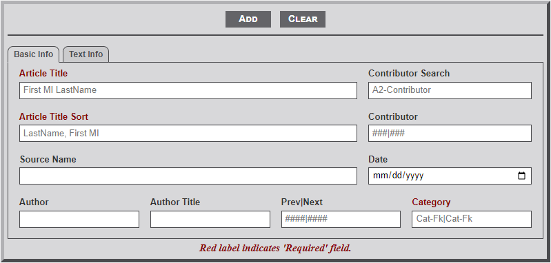
- To Add a record, first enter the record information in the fields provided. Note that on some fields the Label is indicated by red lettering. This indicates that the field is a required field. Thus, the module will not add the record to the database until information is entered in the field. (See more about field structure below.) Select the Add button after the information is entered to add the record to the database.
- To Edit a record first select the desired record from the table below the form by locating the record and clicking on the table row. This will populate the form area with the information from the database table's record. Next, make any necessary changes to the record and then select the Edit button. Note that selecting a record for editing changes the form buttons by removing the Add button and adding a Delete button.
- To Delete a record first select the desired record from the table below the form by locating the record and clicking on the table row. As with then populate the form area with the information from the database table's record. Next, select the Delete button. This will then display a confirmation dialog box to confirm the desire to delete the record. Select the Green Delete button or the Red Cancel button to confirm the desired action.
- The Clear button is used to clear all the fields of the form and reset the table to the original state. (See more about the table status in the next section.)
The form Input area below the line contains input elements for all the fields of the associated table. There are several types of input elements. The types of input elements differs for each module as needed.
- The input form element is used to enter information that has a finite length. Thus, the input area is restricted to the number of allowed records. If longer information is needed in the field, contact the system administrator concerning the needed length. Additionally, some fields are set to only allow letters and/or numbers. Fields with a alpha restriction are generally not indicated but it will be obvious if you try to enter a number that is not allowed. Fields that allow only numbers, or special characters, are indicated with a placeholder to indicate the restriction (e.g., ####|####).
- The textarea form element is used for record fields that require long text information. These fields are noted by an increased height to the input area with a triangle in the lower right corner. Dragging the triangle down with increase the height of the field to allow viewing of more information. Some textarea fields also allow entering of HTML code and are so noted with a placeholder stating so.
- The select form element is used to enter specific information required for the record. To obtain the desired information select the element and type the first few letters of the desired information. Note that the field will contain a placeholder indicating the number of letters required before the dropdown information will begin to display (e.g., A2-Something, indicates 2 letters). Entering more than the indicated number of letters will further restrict the number of items shown in the dropdown area. Once the desired information is shown in the dropdown area, select the item to have it entered into the select element field. Some select form elements are used for information only and are not part of the database table record. An example of this use is to obtain the Id number of a contributor. The Contributor field can accept multiple contributor Ids but in a specific format. Thus, the Contributor Select form element is used to obtain the separate contributor Ids.
- The datalist form element is used to enter specific known information required for the record. This type form element is identified by a down arrow to the right of the element area. Selecting the element will display the list of available options. Some forms using this element will have a preset item selected.
- The date form element is used on a few of the forms. This element is identified by the "mm/dd/yyyy" fields and a small calendar icon to the right in the element area. Selecting the icon will display a dropdown calendar set to the current date. Use the arrows to move from one month to the next. Selecting anywhere in the field, other than the calendar icon, will highlight the month. Entering the two digit month will automatically move the select area to the day area and likewise to the year field. Unfortunately, using this field will only allow full dates. Thus, if one of the date items are unknown this field cannon be used.
Table Area
As shown in the below image, the Table Area consists of three parts... Navigation, Records, and Information.
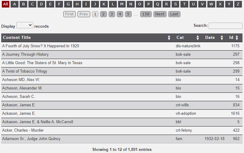
- The Alphabet Bar is used to filter the records displayed in the table. Moving the mouse to hover over a letter will display the number of records in the table that contain records with the hovered letter in the first letter of the first column. Selecting a letter will filter the records in the table to just those records that begin with the selected letter. Selecting the red All button will again display all the records.
- The Pagination buttons are used to move through the table records one group at a time. The four outer buttons are used to move to the indicated name of the button (i.e., First, Prev(ious), Next, and Last). The numbered buttons are dynamic in that the number change as the pagination moves through the records. Selecting a number will thus 'jump' to the relative number of records. Note that this element may not display if the number of records to be displayed are fewer than the number of records indicated in the Display field (See next item).
- The Display dropdown is used to increase/decrease the number of records displayed in the table by a preset number. Select a preset number as desired. This option may not be available on a table that is known to have a few records.
- The Search input field is used to filter the records. Unlike the Alphabet Bar discussed above which only filters displayed records based on the first letter of the first column, the Search field filters records based on the search string entered that is found in any of the displayed columns. A good use of this feature is for selecting a specific record based on the known Id number. For example if you know the Id number is 1234, then by entering the number into the Search field will filter the records by the Ids. BUT... be aware that the filtering process will usually terminate the selection after only the first 3 characters entered. Therefore, not only will the record with Id 1234 be displayed but also 1230, 1231, etc. See the area below on use of the table area for more related to the Search feature. With a large number of records in a database table this is a very useful feature.
The Records area incudes the table Heading and Rows of records.
- The table Heading, identified by the dark area with white text, not only indicates the column names but may also include arrow heads to indicate the ability to sort the column. If the column heading does include the arrow heads then by clicking on the column heading will sort the selected column as indicated by the arrows. Prior to sorting the column will display both an up arrow and a down arrow. Clicking once will sort the column item in ascending order. Clicking a second time will sort the column in descending order. Clicking a third time will return the column order to the original order. Note that with each sort request the arrows will change to display the sort order. The sorted column will also display in a shaded color to indicate the sort.
- The Rows area of the table provides a subset of the records fields from the database table. The different modules of the admin area will display differing number of columns as needed to ensure the proper selecting of a record. To edit a specific record, locate the desired record in the table and select the desired row. This will then move all of the record fields to the form area discussed above. After editing or adding a record the updated information will be updated in the table.
Information Area
Below the Table Area is a brief Information area identifying the number of total records displayed an the total number of records in the table. If the Search feature is used to filter the records the display will also indicate the number of filtered records.
No Comments